I now had the chance to have a closer look at a number of news apps on the iPad. Here is my ranking (To a large extent i agree with the reviews of Engadget):
- BBC News
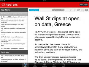
- Reuters News Pro for iPad
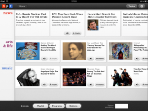
- npr for iPad
- The Wall Street Journal
- USA Today
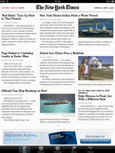
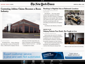
- NYT Editor’s Choice
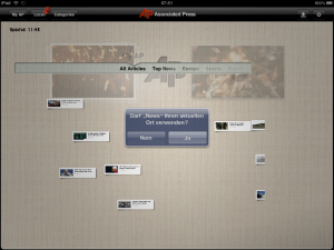
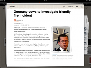
- AP News
- Welt iKiosk
But before i share some background info on why i’m doing this as well as some quick notes and screenshots for the different apps i have to note the following.:
I could not find a single link to any ressource on the web within any of the news apps i tested.
If you happened to find one within these apps or know of a news app that does, i would love to hear from you.
Some background
At the dpa-newslab we are actively investigating the different options for getting newspaper (and news agencies) print and online content onto ereaders and tablet devices.
On one hand this means that we are fully aware of the discrepancies and tensions between different fractions and schools of thought at newspapers, ranging from “This has to look and behave exactly as a printed newspaper” end of the spectrum to the “This has to be a fully digital native experience optimized experience” end at the opposite side of the spectrum (think VIV magazin).
On the other hand this means that we are investigating which of the three main content delivery channels (web, app, ebooks) makes most sense for which kind of content that newspapers and news agencies) have.
Our plan is to come up with a number of prototypes and products that range from the more traditional approaches to the wilder, more visualization heavy ones (Hey, we are a lab). But more about this soon at the newslab blog.
Hence i was very interested to see with which ideas our colleagues came up (given 2 month time and no physical device to test it with). But now the notes on the different apps.
BBC News
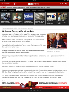
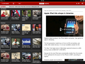
MY favourite app due to its vertical home page layout. The horizontal layout gives either too much or too little space for the index views of the different sections.Intuitive way of moving from article to article (with visual feedback in the index view)
Lots of video that starts super fast, (when it starts at all). Live radio streaming (although only one station :-(.)
Would have preferred a pop over for section selection instead of button bar in vertical mode. Irritating place for tickernear the top of the screen.
Reuters News Pro for iPad
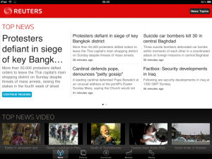
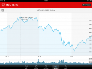
Second place, because of its use of iPad / tablet user interface options in the overview screen and its use of video. as well as the interactive graphics in the Markets and Stocks sections. I’m wodering if the latter are native charting components or done in Javascript. Does Anybody know?
On the minus side: The Article detail view is ugly and the split screen accordion view in horizontal mode is overkill.
npr for iPad
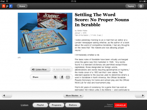
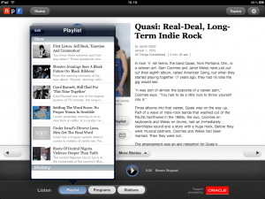
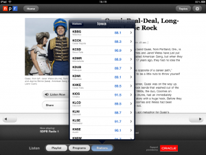
Third place, but close to Reuters. Clearly shows its radio heritage and focus, by indcating which articles are available as audio. Easy to build a playlist and listen to it. Vast array of radio live streams (grouped by state) with ability to store favourite stations.
Big minus, no possibility to configure the topics of the home screen.
The Wall Street Journal
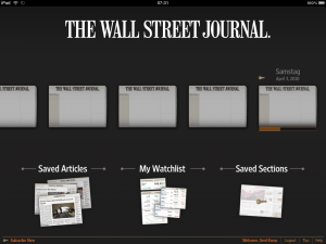
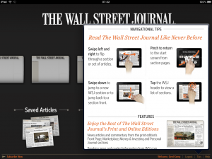
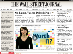
Clearly the best of the applications that follow closely the printed paper layout. Nicely lay out index pages. Interesting navigation betwenn sections and articles within a section by vertically and horizontally swiping, Clever visual implementation of the paywall by obscuring parts of the screen.
Minus: Sending emails with forgotten passwords does not work. No font size change at the index pages possible (too hard a problem to recalculate the layout?) Pop-Up ads too intrusive.
USA Today
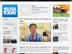
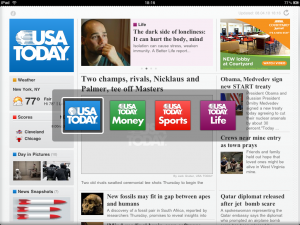
Often crashing app that tries to mimick the printed version. Nice solution for navigating between the sections.
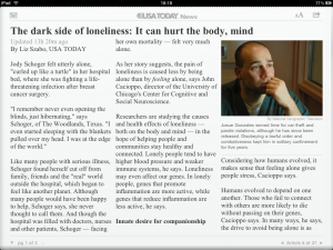
But the Home pageuses iFrame like tricks. Small imagages in articles. Strange way of navigating within the pages of the article (vertically) and between the different articles of a section (horizontally). I expected it the other way round (IMHO the pagination of the articles would also have been technically easier that way).
NYT Editor’s Choice
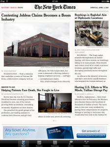
A step back from what was shown on Jan. 27th. Clearly the print people had a say. Too little content wrapped in a layout that resembles NYT skimmer and the NYT reader Air App and hence inherits the nice multicolumn arbitrary width layout of the single article pages).
AP News
Sorry my dear friends at the AP. I simply don’t get it.
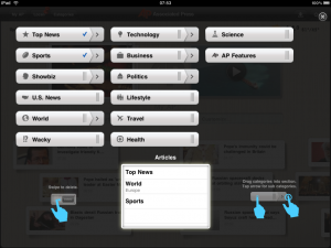
Minus: Confusing design metaphor (at least for europeans). Figure it should resemble a bulletin board. These look distinctly different in germany!. Is the lower half of the index page a timeline or not? Waste of screen estate by not using the whole screen at the detail level (text, images, and video) Too small images and videos, Completely counterintuitive and non HIG way of personalizing it, …
Plus side: Possibility to localize the news (but no longer german news, since AP sold it’s german subsidiary to ddp. Content available in th iPhone App though)
iKiosk
Weirdly named application by the german newspaper Die Welt (Part of Axel Springer)
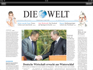
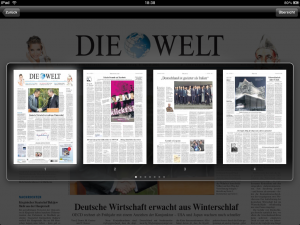
In short: A very thin wrapper around the PDF version of the paper, that does not work, since everything that triggers the accelerometer, unzooms to the whole page view (in which you can’t read anything). Unless this is fixed totally useless, afterwards only useless or a scam since after a 30day trial period the paper is only marginally cheaper than the printed version (ok. it’s free for print subscribers)
But presumably was worth doing it from a corporate point of view since it enabled Axel Springer Chairman & CEO Matthias Döpfner to show something in his talk with Charlie Rose (for a couple odf seconds)
